CuriosIT - Gamified Learning Platform UX Design
A learning app for children that plays like a game and scrolls like a feed.
Company
Technomatic Academy
My Role
Industry
Education
Date
April 2024
The problem
Lessons lose to games
Interviews showed that children lose interest in traditional learning. Activities had to feel like play to hold their attention.
Complicated tools get dropped
Children, teachers and parents all had to use it. Anything fiddly would put people off coming back.
Adults feel left out
Parents and teachers want to support a child’s learning, but often can’t see how it’s going.
The solution
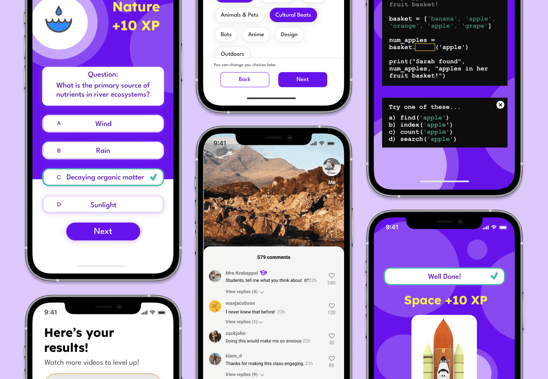
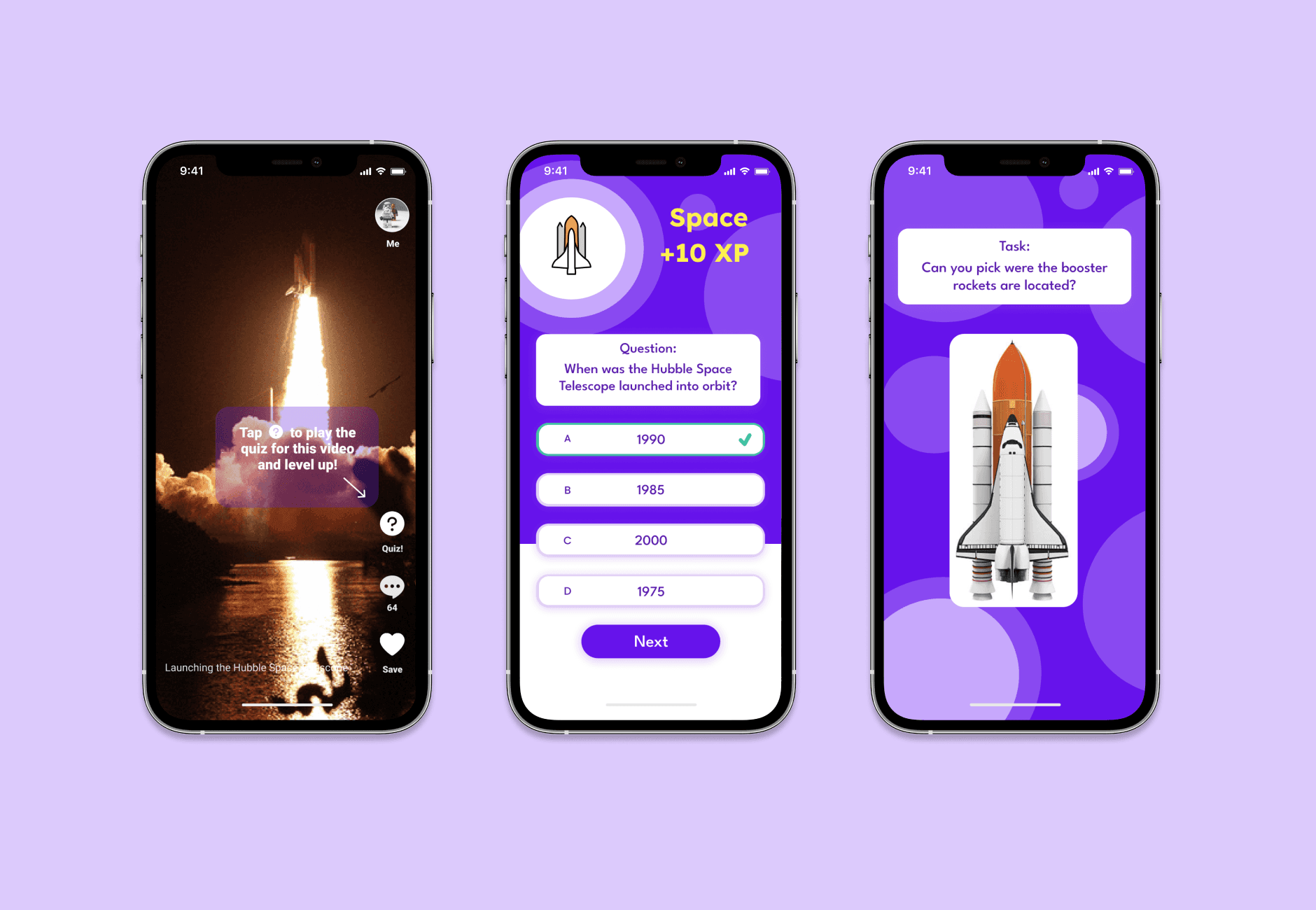
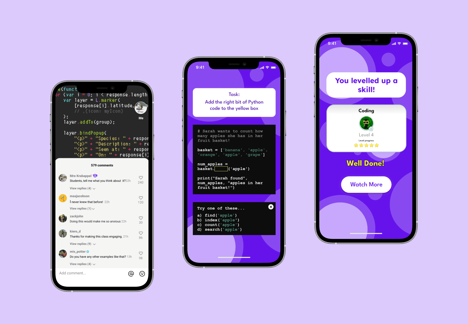
CuriosIT turns lessons into short, reels style videos that children swipe through. Quizzes and games follow on from each video, so watching leads straight into doing.
Every quiz and game earns experience points, and each subject levels up as they go. Teachers and students can also chat inside the app.

Background
I was the product designer on CuriosIT, covering discovery, UX and the visual design. The work started with stakeholder meetings at the academy to agree what the app needed to do.
Then I went and spoke to the people who would use it.
Research
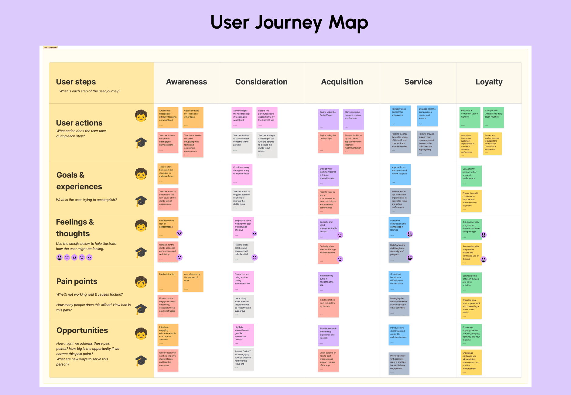
I interviewed teachers, parents and children. Their answers shaped the user journey map and showed where each group got stuck.
Two findings stood out. Content had to be age appropriate, and interactive elements were what kept children motivated.
I sorted the interview notes with affinity mapping, which grouped them into themes.

Define
Each theme became a Point of View statement and a How Might We question.
These three guided the features and the user journeys.
Engagement
Point of view
Children need learning activities that feel like games because they lose interest in traditional learning approaches.
How might we
How might we design learning activities that are as engaging as games while ensuring educational value?
Usability
Point of view
All users need a simple and intuitive platform because complex tools can discourage consistent use.
How might we
How might we ensure the platform is easy for all user groups, regardless of their technical skills?
Trust
Point of view
Parents and teachers need visibility into their child’s learning progress because they want to support their education but often feel left out of the process.
How might we
How might we give parents and teachers clear insights into their child’s progress in an accessible way?
Design
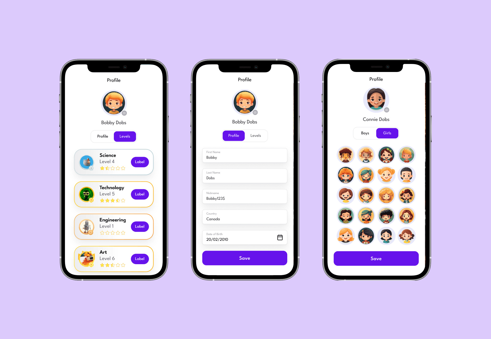
I borrowed from the apps children already use. The swipe-up video feed, chat and profiles work the way they expect, so they can get on with learning.
Progress they can see
Experience points and subject levels show children how far they’ve come and give them a reason to return.
Fun for children, practical for adults
The layouts are clean and the components are colourful. The brand had to appeal to children while staying practical for teachers and parents.
Results
user groups interviewed: teachers, parents and children
How Might We questions that shaped the features
interactive prototype, tested and refined
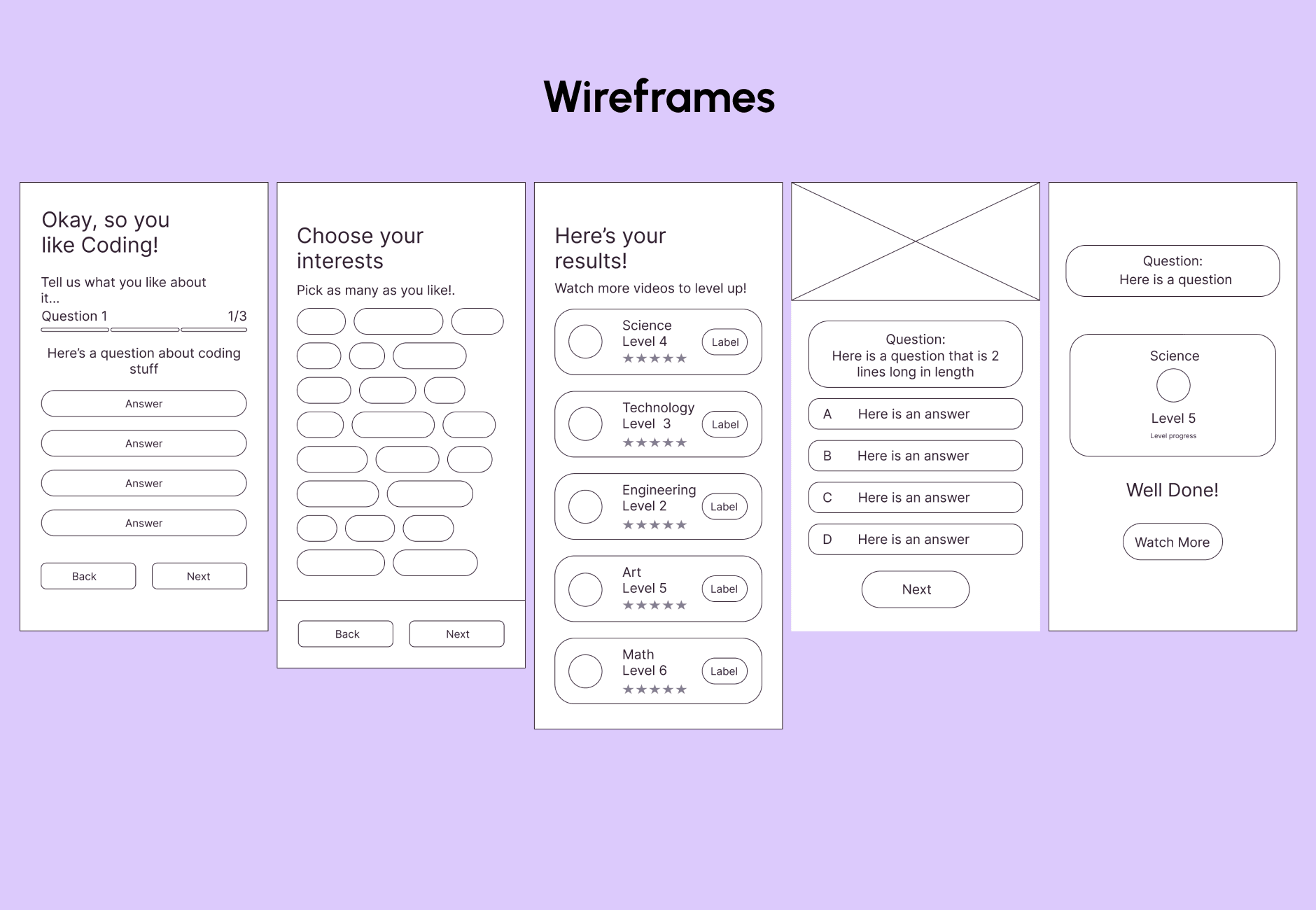
The prototype covers onboarding, the video feed, quizzes, games and profiles. I tested it to check the features held up, then refined the design through iteration.
The final screens became the basis for the CuriosIT design system, so future products could stay consistent.
You can try the prototype yourself using the button below.
Reflection
The hardest part was that children, teachers and parents each needed something different from the same app. Writing a Point of View for each group early on kept all three in view when deciding features.
Borrowing familiar patterns from social apps also paid off. There was less for children to learn before they could start.
What I’d do next
Trust is the question I’d return to first. Parents and teachers wanted clear insight into a child’s progress, and that deserves its own round of design and testing.